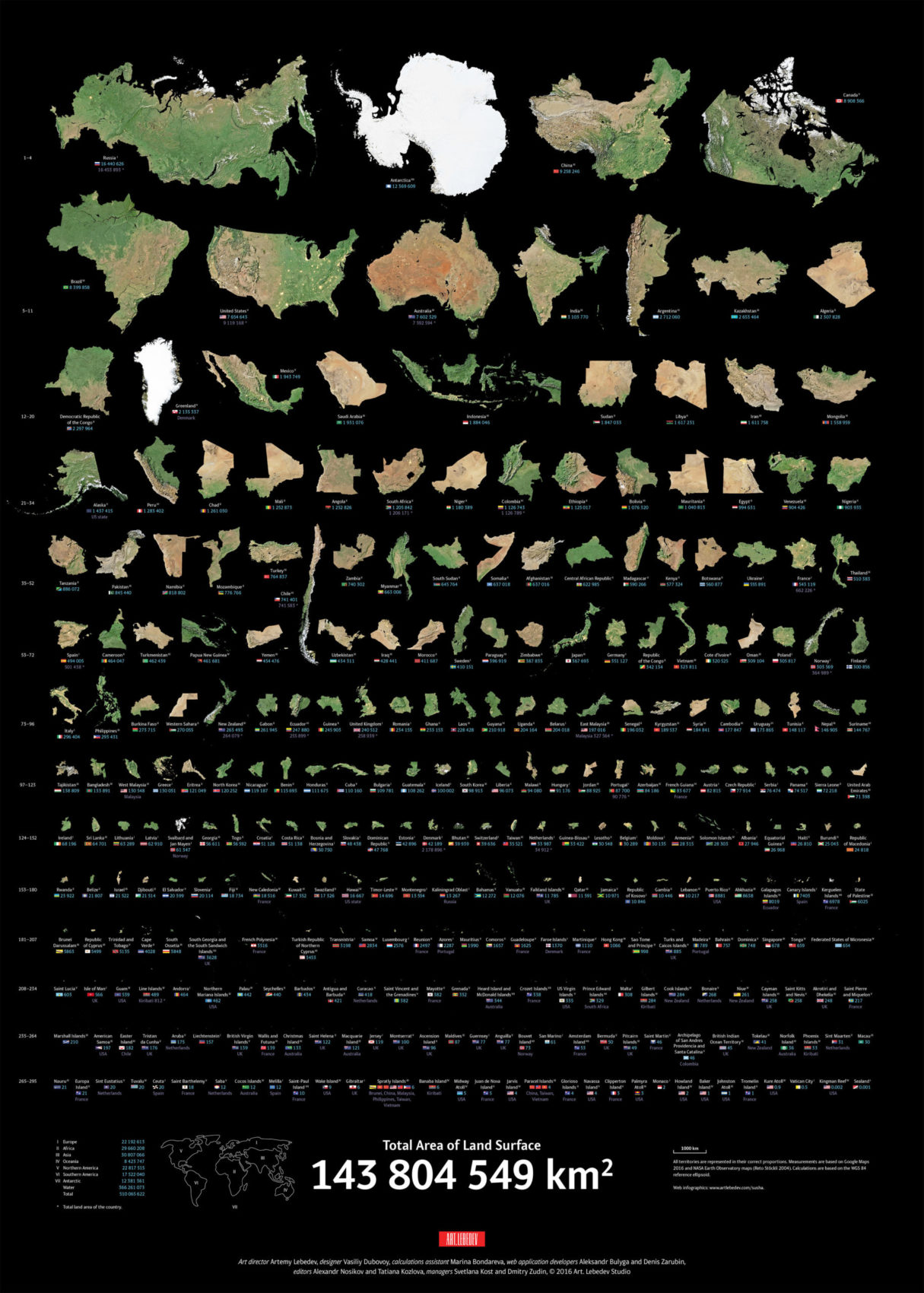
Most representations of the world do not accurately project their true size, this visualization does. The Mercator projection is a cylindrical projection of the world that was created for nautical navigation. This projection, while the most common projection, has a large flaw–it distorts the size of most countries.
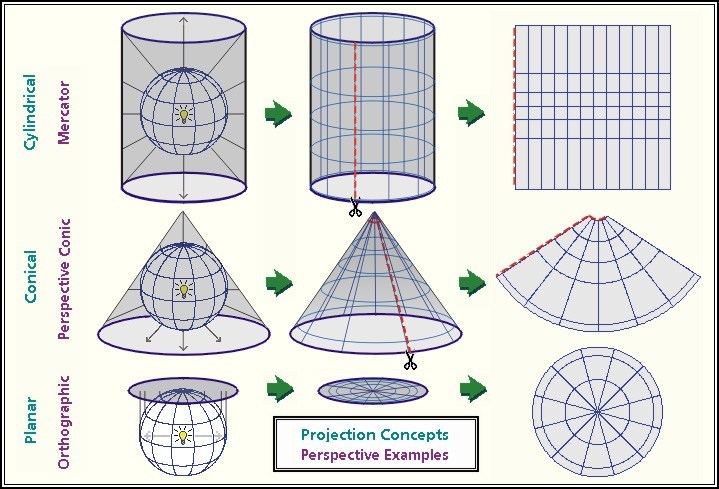
The largest problem with projecting a 3D object in 2D is that some dimensions will always get distorted. Throughout the history of map-making cartographers have struggled with how best to project the world most accurately. In fact, in 2018 Google Maps changed to a more accurate ‘globe’ projection, moving away from the Mercator projection.

Take a look at these cool websites if you like checking out maps:
- Art Lebedev Studio created a comparison to accurately gauge the size of each country.
- Mappery has many unique maps from around the world.
- CALTOPO is great for planning routes and navigating the backcountry.
- Muir Way has many amazing maps for sale including hydraulic maps of every state.
Country 5 top : Russia Canada USA China Brazil not Russia China Canada Brazil USA
USA is the 3rd largest Country, duh
Go update your Wikipedia hahaha
Sealand: 0000000000001 square miles
KIngman Reef: 0000000000000005 square miles
The Rest: 1,238569877938648 square miles
you can just call it kallingrad y’know
Where is Kallingrad Oblast
Mexico is not bigger than Saudi Arabia
the usa is bigger than brazil.
Antarctica Is not a Country it’s a Continent.
Why is China bigger than Canada
Because of land
dum bad Usa is bigger than china and brazil turkey is bigger than chile
Wtf its the true size of countries
Bruh its the true size of countries
Only lower 48 bud.
ilove usa