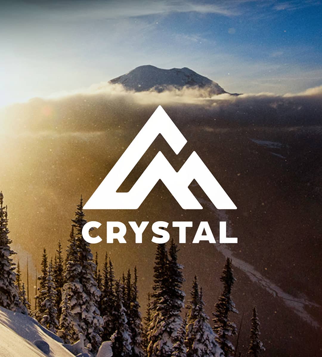
Washington’s biggest ski resort, Crystal Mountain, has had a busy summer season. As well as spending $4.6 Million on improvements, largely to improve the customer experience, they have also been working on rebranding and a new logo. Which they unveiled yesterday.
WE HAVE A NEW LOGO
Crystal Mountain’s logo is based on the dramatic geography of our resort, with a nod to our rich heritage. The heritage is expressed through the evolved use of the C and M letterforms. We also found it important to include our iconic three summits and neighboring Mount Rainier through the playful interplay of ridges and peaks.
NEW COLOR PALETTE
Inspired by nature our new color palette includes colors like Huckleberry Blue, Indian Paintbrush and Sunrise Yellow. Colors that really drive emotion and connection to the Pacific Northwest Spirit.
Crystal Mountain is the largest ski resort in Washington State with a total of 2,600 acres and over 50 named runs. Puget Sound skiers and riders flock to the slopes during the winter months to enjoy breathtaking views of Mt. Rainier and to ride some of the best terrain in Washington State, only 2 hours away from Seattle in the heart of the Cascade Mountains. Crystal also operates the Mt. Rainier Gondola for scenic rides during the summer so that guests can enjoy the beautiful views of Mt. Rainier all year long.


Gee a Mountain as your logo?! No way?! What an original idea for a resort. How much did you pay for someone to come up with that generic concept? granted it’s better than the old one, but that’s not sayin much. looks like so many other places it does not stand out. Also the logo does not “drive emotion and connection to the Pacific Northwest Spirit.” in any way….
Agreed