Colorado has a new logo and this is it. The motto that goes along with it is: “It’s our nature.”
Colorado’s governor decided it was time to have a brand for Colorado and this is what a team of designers came up with for the state’s logo that will soon be ubiquitous within Colorado. We’ll let ‘Brand Colorado’ explain the rest:
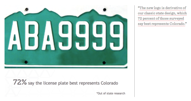
Like Colorado itself, our new logo combines the familiar with the unexpected. It draws clear influence from our world-famous mountains and beloved license plate. But its shape, an upward facing arrow with rounded corners, also serves as a symbol of Colorado’s momentum and a reminder of its friendly and approachable attitude. While our new identity certainly isn’t everything Colorado is, it will serve as a constant and consistent reminder of everything our spectacular state can be. – Brand Colorado


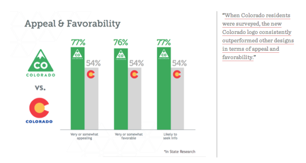
They manipulated the research to justify eliminating use of the flag as part of the logo. This, because Governor Hickenlooper may run for President and wants to distance himself from the marijuana industry. The flag is public property and cannot be trademarked. The green triangle can and is trademarked, and will not be available to this “federally-illegal” industry. They don’t really care that people from Colorado can’t stand the new logo because the real audience is people outside of Colorado that they want to move here and stimulate the economy. This could have had tremendous value in terms of a buy-local campaign. Shouldn’t that have been the point? Now it has seriously upset residents and the Denver Post who feel excluding the flag ignores our heritage. The Governor (a non-native) has made a bad move with this decision. Now the whole thing will probably die instead of be corrected as that will only highlight how much money he has wasted under false pretenses. That’s the real story.
What 2 choices, Lame and Lamer.
Logo = lame
Motto = maybe better?
Kinda cartoony
I think it works.