This article originally appeared on climate.gov
El Niño—the warm phase of ENSO, which is short for El Niño-Southern Oscillation—is still hanging on in the tropical Pacific, but signs are pointing to a quick transition to neutral conditions by the April–June period. There’s a 62% chance of La Niña getting the golden ticket by June–August. Stay tuned, because La Niña affects global climate patterns, including the Atlantic hurricane season and North American winter.
Red carpet
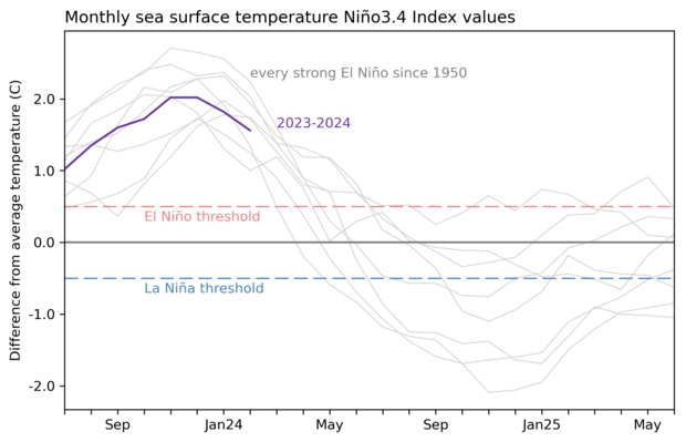
The sea surface temperature in the Niño-3.4 region of the tropical Pacific (our primaryENSO-monitoring region) was 1.6 °C (2.9 °F) above the long-term average (long-term = 1991–2020) in February, according to our most reliable dataset, ERSSTv5. This is still comfortably above the El Niño threshold (0.5 °C above the long-term average), although clearly off the peak from late last year.
For your consideration
We monitor the temperature of the water under the surface of the Pacific, roughly the top 300 meters (~1000 feet), for signs of what’s to come. This subsurface water has been warmer than average for the past year, feeding El Niño’s warm surface water. However, the subsurface warmth peaked in November, and has been gradually waning over the past few months, becoming cooler-than-average in February. An upwelling Kelvin wave—a blob of cooler-than-average water that sloshes from the west to the east under the surface—developed in January, strengthening and rising toward the surface through February. In fact, a small region of cooler-than-average surface water developed over the past week or so, which you can see in the NOAAView Data Exploration Tool.
This change in the subsurface adds to our confidence that El Niño will continue weakening. Most of our computer climate models predict that neutral conditions will develop by April–June, and forecasters estimate an 83% chance of this.
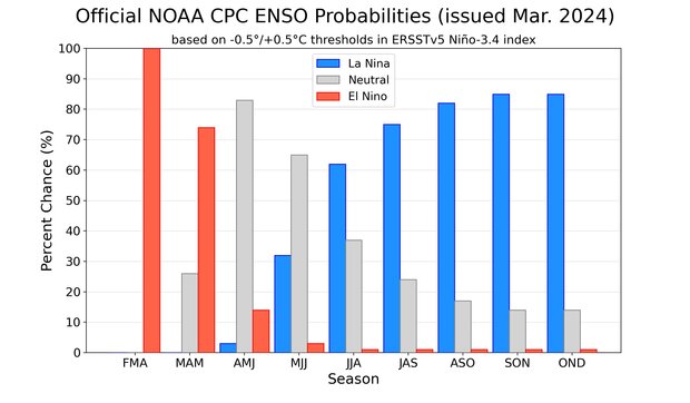
There’s a 62% chance that La Niña will arrive by June–August, but there’s also about a 1-in-3 chance it will develop even earlier, by May–July. La Niña following close on the heels of a strong El Niño is fairly common, occurring after 5 of the 8 strong El Niño events in our historical record (starting in 1950—Tom has more details about the numbers in his post last month.)
One theory about why this El Niño-La Niña handoff occurs is called the “recharge-discharge oscillator.” Heat builds up in the tropical Pacific during El Niño, raising the local sea level in the central and eastern equatorial Pacific. This gets uncomfortable for Nature, and to get back to normal conditions, ocean currents move the heat away from the equator, and cooler water from deeper levels rises up—sometimes, enough cool water to swing into La Niña. There’s a lot more to this mechanism than I’ve covered here, so for more details check out Michelle’s excellent post “the life and death of El Niño.”
Broadcast
While ENSO calls the tropical Pacific home, its reach is global. In the likely event that La Niña develops, it will affect global temperature and rain/snow patterns just as El Niño did this past winter (more on that in a minute!). These impacts are never guaranteed, but ENSO tilts the odds toward specific patterns, giving us an early picture of potential upcoming conditions.
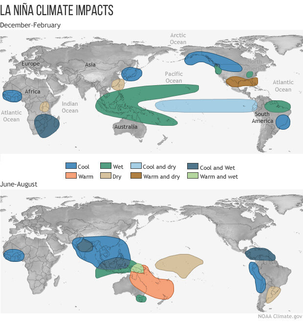
La Niña can also be a supporting character in the Atlantic hurricane season. In a nutshell, La Niña tends to reduce wind shear—the change in wind between the surface and high up the atmosphere. Less wind shear can make it easier for hurricanes to strengthen. NOAA’s hurricane outlook comes out in May, so we’ll know more then about how La Niña, ocean temperatures, and other factors are likely to affect hurricane activity this season.
In memoriam
Nat will delve into how U.S. precipitation played out this past winter in his post later this month, so I’ll just briefly touch on one very notable feature of this winter’s temperature pattern here—the warmest winter on record for the Great Lakes and Upper Midwest, causing historically low ice levels in the Great Lakes. El Niño influences winter temperature, so can we blame this on El Niño? Not so fast!
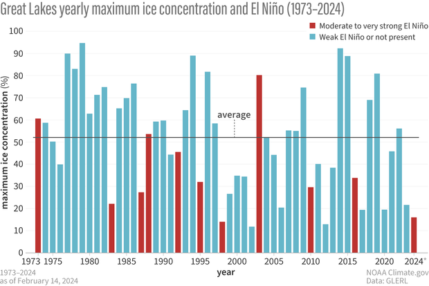
Brian Brettschneider, climate expert and Friend-of-the-Blog, took a look at how often winter temperature was above average during past strong El Niños. Overall, we could say around 2-in-3 El Niño winters in the Great Lakes were warmer than average (see footnote). So far, so El Niño.
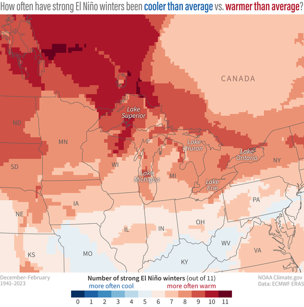
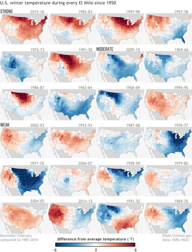
There is a lot of variety in those winters, as we can see when we look at each one individually.
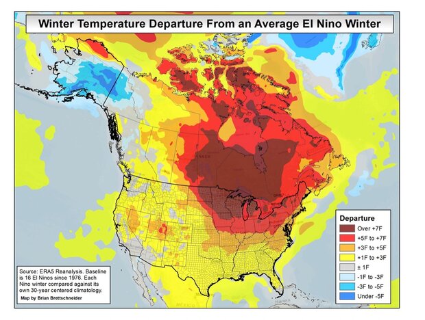
While El Niño and its extended Pacific jet stream likely played a role in keeping much of North America abnormally warm, likely, climate change was also at work here. A few lines in an ENSO Blog post is not enough to attribute what part of the record warmth was El Niño, what part climate change, and what part other factors, including our old friend random variability. As the band is playing me off the stage, though, I can leave you with this picture from Brian, where he’s subtracted the average El Niño impact, based on previous El Niño events, from the 2023–24 winter. As you can see, there is a lot of warmth left on the table that is not consistent with your average past El Niño.
Footnote
Whether a winter was above- or below-average was based on comparison with a 30-year rolling average centered on the winter in question. These maps are based on the “ERA5” reanalysis from the European Center on Medium-range Weather Forecasting, which covers the global climate from January 1940 to the present. A reanalysis is when scientists use a climate model to fill in gaps in past observations. Many observational records are incomplete, due to stations moving, being discontinued, or missing data. Using a climate model, we can connect the dots between missing data and create a continuous record of the past climate. Reanalysis is an invaluable, widely used technique.