If you’re still searching for something to talk about with Aunt Edna at the Thanksgiving dinner table, I have some good news for you – it’s time for my annual NOAA Winter Outlook post! (footnote #1) If this post gives you a feeling of déjà vu, I can understand why; for the second year in a row, La Niña has developed and is expected to impact the U.S. weather and climate during the upcoming winter. Will we see a typical response to La Niña this year (sure didn’t see it last year) or will other factors play a more significant role than La Niña again this year? Are La Niña impacts more reliable in the second year of a “double-dip” event? Finally, how will the update to the long-term temperature and precipitation averages affect the outlooks? So many questions, so little time (Aunt Edna is in for a treat), so let’s get started!
Sitting at the head of the table
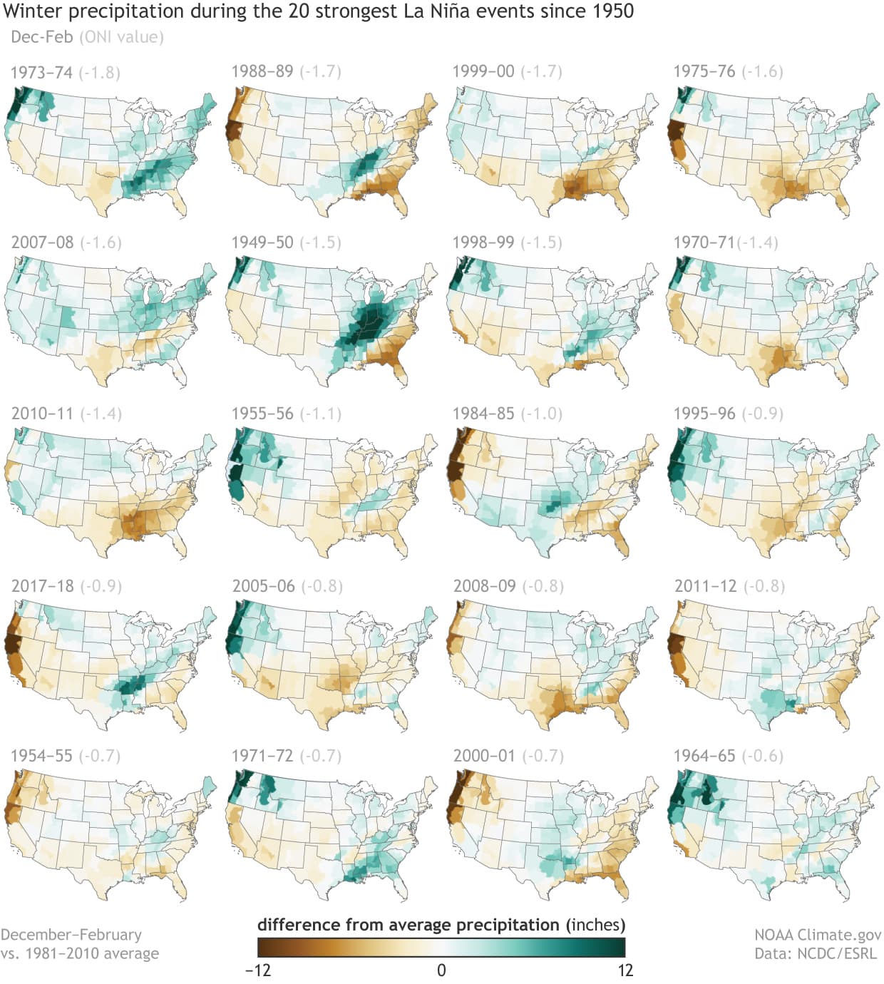
What I’m about to write shouldn’t surprise long-time blog readers, but the occurrence of La Niña (as well as El Niño) often exerts a significant influence on winter climate over North America. This influence results in enhanced predictability, as the patterns of both temperature and precipitation during most episodes share many features. In fact, much of the historical skill for seasonal precipitation forecasts stems from the occurrence of La Niña or El Niño. For instance, as I discussed in last year’s post, most of the 20 strongest La Niña events of the past 70 years brought drier-than-average conditions across much of the southern tier of the U. S., particularly along the Gulf Coast. Also, those La Niñas were linked to wetter-than-average conditions in the Great Lakes/Ohio Valley region, the Pacific Northwest, and the northern tier of the U.S., although there is less consistency to these impacts. Of course, the reliability of the La Niña influence is far less than 100%, with the dry signal occurring about 70-80% of the time in the Southeast and the other signals even less reliable.
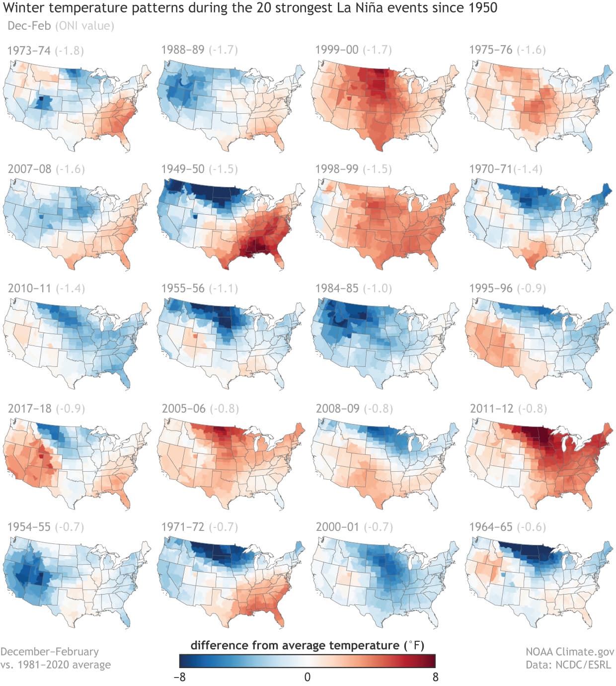
La Niña’s influence is generally less consistent for winter temperature than for precipitation across the United States. There is some tendency for above-average temperatures across the southern U.S. and cooler-than-average winters across the northern Plains, but the frequency of either signal has generally been less than 60% in the historical record. Temperature trends during winter also factor into the picture: La Niña winters during the later events generally have a reduced footprint of below-average temperatures due to long-term winter warming over most of the U.S.
Prepping for second
Since we’re entering the second winter of a “double-dip” La Niña, let’s consider the second year of the previous seven double-dips La Niñas (footnote #2). In doing this, we see that the observed precipitation during the second winter is fairly consistent with the average across all La Niña winters. However, as Nat pointed out a few years ago, a study suggests that U.S. drought tends to intensify in the second winter of a double-dip La Niña, which is a finding that is unwelcome news for the drought-stricken western U.S.
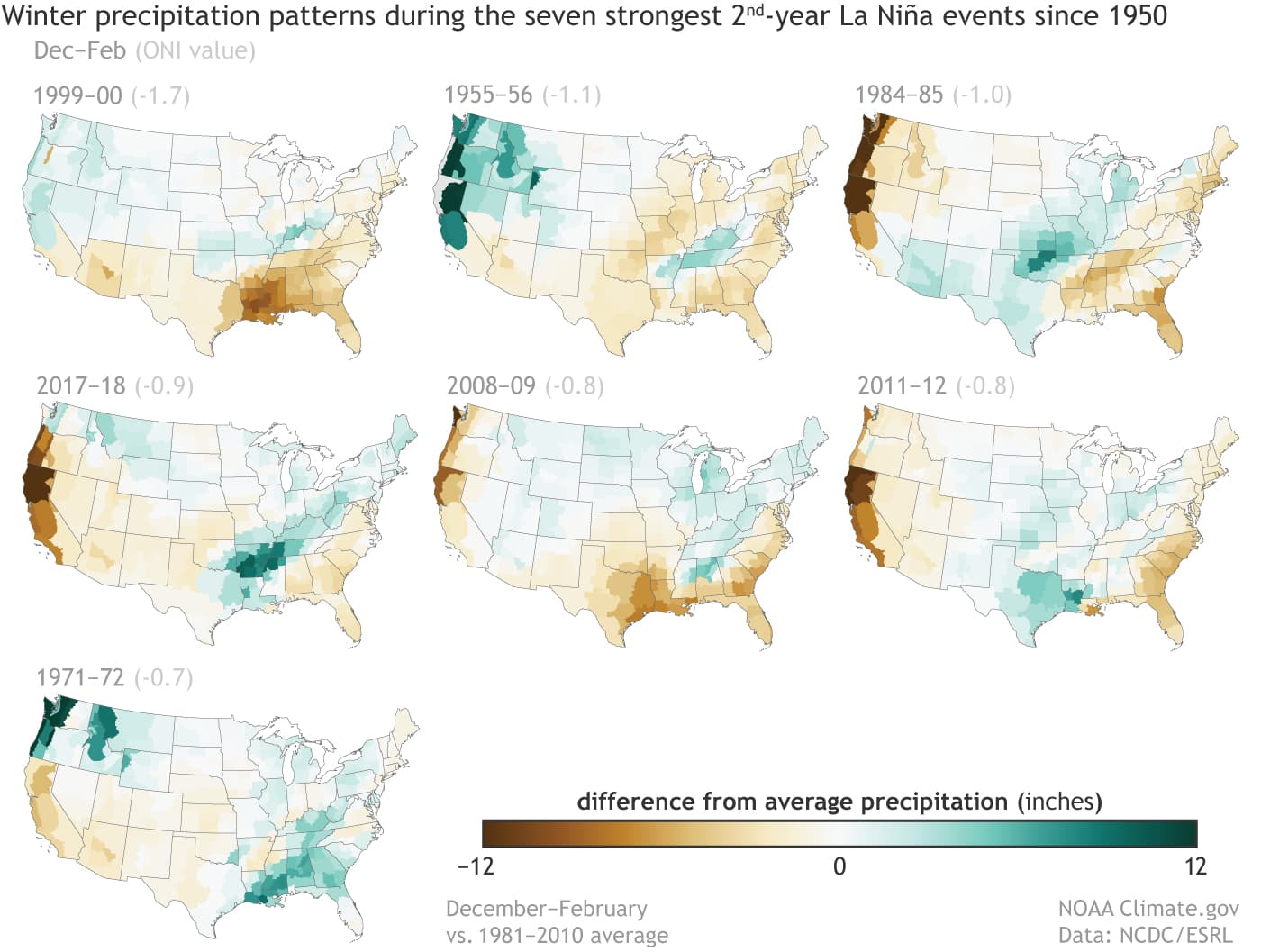
The observed temperature during these winters appears to be dominated by a climate change signal, with the earlier years generally colder than the later years. Of course, seven cases is a very small sample size, so for temperature and precipitation, it’s tough to draw much in the way of conclusions—some part could just be internal variability (for more, see this excellent recent post by Michelle).

Embracing a new perspective
One other topic I’ll briefly discuss is the update to the base period that defines the “long-term average” for the temperature and precipitation outlooks. For the previous winter outlooks I’ve written about, forecasts were always relative to “normal” defined by the 1981–2010 average. However, as Emily discussed earlier this year, the base period averages are revised every 10 years in order to ensure that outlooks are being issued relative to the contemporary climate. So, for the next 10 years (including this one), NOAA Climate Prediction Center (CPC) outlooks will be relative to the 1991-2020 long-term average.

The long-term warming trend has resulted in some notable changes in the new normal conditions defined by the 1991–2020 base period. For example, the December-February temperatures that define above-normal conditions (footnote #3) have risen by 0.5-1.0°C (0.9-1.8°F) in much of the eastern part of the nation in the new long-term average, with smaller differences (generally between 0.25-0.5°C (0.5-0.9°F)) over much of the western and central parts of the nation. Very little change is observed in parts of the northern and central Plains and West Coast. The below-normal temperature threshold increases are generally similar to those of the above-normal category, whereas the changes in normal precipitation conditions are generally small (not shown). Bottom line, our “new normal” is getting warmer.
The main course
So how does CPC see weather shaping up this winter? Not surprisingly, the outlooks bear a strong resemblance to the average La Niña conditions and to last year’s outlook, during which La Niña was well established prior to winter. Of course, last year’s winter forecast was not very successful, as Tom detailed in this post. However, that doesn’t mean we should expect a repeat of last winter’s conditions. The only significant difference between this winter’s outlook and the outlook for 2020–21 is that the chance of above-normal temperature is about 5-10% less than it was last winter, likely the result of somewhat higher above-normal temperature thresholds due to the change in long-term averages described above.
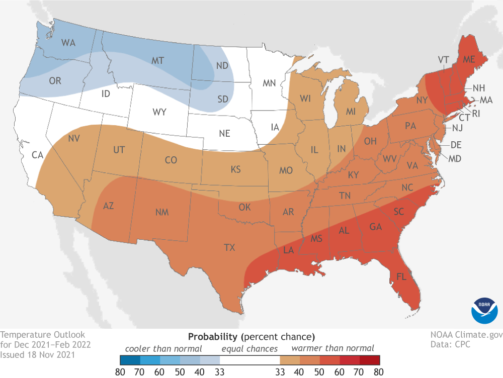
Specifically, the CPC outlook (footnote #4) favors above-normal temperatures across the southern and central U.S., extending northward to the Midwest and along the East Coast up to Maine. Above-average temperatures are also favored in Hawaii. Chances exceed 50% only in parts of the deep South from Texas to North Carolina and in New England. Probabilities are tilted toward colder-than-normal temperatures along the northern tier from the Pacific Northwest to the Dakotas and across much of Alaska. However, the probabilities for below average in these regions are less confident, with none reaching 50%.
The precipitation outlook favors below-normal precipitation across the entire southern tier of the country and in southern Alaska, with southern New Mexico, west Texas, and southern Florida most likely to experience a dry winter. In contrast, above-average precipitation is most likely in Hawaii, western Alaska, and across parts of the northern CONUS including the Pacific Northwest and northern Rockies, and around the Great Lakes and the Ohio Valley. Confidence in these regions is less than across the South, with probabilities not reaching 50%. If the winter precipitation outlook verifies well, we would expect some relief from the western U.S. drought in the Northwest but, unfortunately, intensified drought in the Southwest.

CPC issues seasonal outlooks so that users can take risks and opportunities into account when making climate-sensitive decisions. Due to the nature of their uncertainties, they are issued as probabilities, which means that the forecasts won’t always result in the favored (or expected) outcome. Therefore, benefitting from these outlooks requires users to play the long game. Over a longer period of time, these outlooks have proven to have skill so that while some will “bust,” enough will be correct for the user to come out ahead.
Lead editor: Nat Johnson, NOAA GFDL
Footnotes
- This post discusses the November update to NOAA’s Winter Outlook that was originally released in October. The NOAA Climate Prediction Center’s seasonal outlooks are updated each month all year long, but the November update to the Winter Outlook is the forecast that is used for verification.
- I would just like to point out that the winter of 1974/75 also meets the second winter of a double-dip La Niña criteria, but it is not included in this analysis because it was not one of the top 20 strongest La Niñas.
- Technically, the thresholds that define the below-normal and above-normal categories in CPC outlooks are defined by terciles in the temperature or precipitation distributions. The terciles are the 33.33 and 66.67 percentile positions in the distribution. In other words, they are the boundaries between the lower and middle thirds of the distribution, and between the middle and upper thirds. These two boundaries define three categories: below-normal, near-normal and above-normal.
- A standard reminder about the format of CPC outlooks: the forecasts show the probability of the favored category only when there is a favored category; otherwise, they show EC (“equal chances”). An EC forecast doesn’t mean that near-average temperature or precipitation is expected this winter in those regions, but rather that there’s no tilt in the odds toward any of the three outcomes. In the maps, the probability is shown only for the favored category, but not for the other two categories. Often, the near-normal category remains at 33.33, and the category opposite the favored one is below 33.33 by the same amount that the favored category is above 33.33. When the probability of the favored category becomes very large, such as 70% (which is very rare for a seasonal outlook), this rule for assigning the probabilities for the two non-favored categories becomes different.
This post first appeared on the climate.gov ENSO blog and was written by Mike Halpert.