El Niño is zipping along in the tropical Pacific. There’s a 54% chance that this El Niño event will end up “historically strong” (more details below), potentially ranking in the top 5 on record. Looking ahead, it’s likely that El Niño will end and neutral conditions return by April–June.
Sail across the Pacific
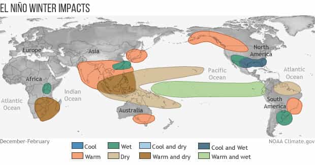
El Niño is associated with specific changes to weather and climate around the world, and the stronger an El Niño, the more likely we are to see those impacts. Of course, nothing is ever guaranteed when it comes to our complex Earth system, and the unpredictable effect of chaos may interrupt the expected impacts. For an excellent, in-depth explanation of why a strong El Niño provides the best information for making seasonal predictions, and yet weather can still upend those predictions, check out Nat’s recent post.
Our primary metric for the strength of an ENSO event (ENSO = El Niño/Southern Oscillation, the whole El Niño and La Niña system) is the three-month-average temperature of the central tropical Pacific Ocean, specifically in the Niño-3.4 region. The temperature anomaly—the difference from the long-term average, where long-term is currently 1991–2020—in this region is called the Oceanic Niño Index (ONI). We use a three-month average because ENSO is a seasonal phenomenon, meaning it persists for at least several months. We don’t have official strength definitions, but, unofficially, an ONI anomaly of 1.5 °C or warmer is considered a strong El Niño, with 2.0 °C the threshold for “very strong” or “historically strong.”

The most recent ONI anomaly, for September–November, was 1.8 °C. November, what I’m showing here in this graph, was 2.0 °C. Many of our computer models predict that it will hang out at or above 2.0 °C long enough to achieve “historically strong” status.
The El Niño events in our record (starting in 1950) with the largest Oceanic Niño Index values are 1972–73 (2.1 °C), 1982–83 (2.2 °C), 1997–98 (2.4 °C), and 2015–16 (2.6 °C). Maybe you’re wondering if the fact that those numbers are in increasing order means that El Niño is getting stronger overall? It probably is not. First, I’ve only picked out the very strongest El Niño winters from the 25 in our record, and there are plenty of weaker events sprinkled in. Also, it’s very unlikely that this event will top 2.5 °C, which would break the pattern.
Instead, the gradual rise in the strongest ONI anomalies is more likely a sign that that some influence from global warming remains in the Oceanic Niño Index, even though we try to remove it by using a rolling 30-year period as our long-term average. For more on this complication, as well as a possible solution, check out Michelle’s post “Is ENSO running a fever, or is it global warming?” She also has a new paper, written with colleagues at the Bureau of Meteorology in Australia, that gives details on an alternative ENSO index.
Sky dive
El Niño is more than sea surface temperature, though. The atmospheric component is just as important, as the atmospheric circulation above the tropical Pacific—the Walker circulation—responds to the changes in the ocean surface temperature and helps to reinforce them. This atmosphere-ocean coupling is critical to ENSO. In the case of El Niño, the warmer-than-average central and/or eastern tropical Pacific leads to more rising air and storms over that region, less over Indonesia, and weaker-than-average upper-level winds and near-surface winds (the trade winds). Overall, this means a weaker Walker circulation.

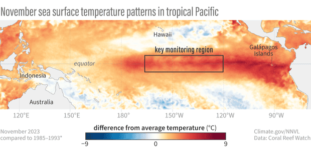
So how is the atmosphere looking, with our current strong, possibly on its way to very strong, El Niño? Looking at the map above, we see a pretty clear signal over the past 30 days of more clouds over the central Pacific (purple, showing that less surface radiation is escaping to space, because it’s being blocked by clouds) and less over Indonesia (orange, where more radiation is making it to the satellites, because there are fewer clouds).
There are a few other ways of measuring the atmospheric response. The Southern Oscillation Index compares the surface pressure in Tahiti to that in Darwin, Australia. When the pressure is lower than average in Tahiti and higher than average in Darwin (a negative index), it is an indication that the Walker circulation is weakened. In November, this index was -0.8.
The Equatorial Southern Oscillation Index (SOI) is another measure of pressure patterns across the tropical Pacific, specifically the average over the western Pacific versus the average over the eastern Pacific. As with the original Southern Oscillation Index, a negative Equatorial SOI shows that the Walker circulation is weaker than average. November 2023 was -1.3. For context, this means the atmospheric signal is approximately in the top third of all El Niño events for this time of year.

Why do we have two indexes that sound like they measure the same thing? The Southern Oscillation Index extends back to 1866, but only measures the pressure at two specific stations, meaning it is more susceptible to short-term weather fluctuations. The Equatorial SOI record starts in 1950, same as our well-observed sea surface temperature record, and measures the average over two very large geographic regions. The larger areas mean that the Equatorial SOI is more resistant to the variability caused by random storms influencing a certain location, etc.
SCUBA
Near the equator, the steady, east-to-west trade winds usually keep warm water piled up in the far western Pacific. When they slow, this warm water can slosh eastward under the surface as a downwelling Kelvin wave.
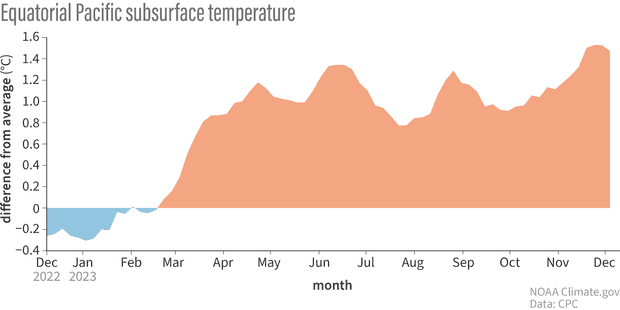
There were some pretty strong “westerly wind bursts,” what we call it when the trade winds slow, during November. These events kicked off a downwelling Kelvin wave, increasing the amount of warm water under the surface of the Pacific. The amount of warm water is still lagging behind what it was during the strongest events on record, as I discussed in October, but it’s a solid source of warm water that will continue to feed the surface over the next few months. For reference: equatorial Pacific subsurface cross-sections from November 1982, 1997, 2015, and 2023.
Bungee jump
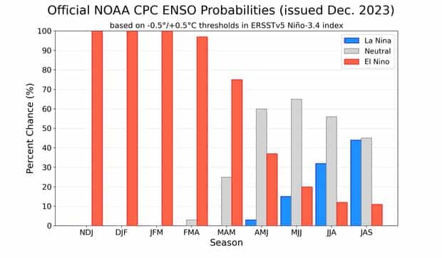
What goes up must come down! Our current thinking is that neutral conditions are most likely to develop by April–June. Then… what’s that blue bar lurking on the right side?? La Niña and neutral are nearly even odds for July–September, with El Niño a distant third. Most, but not all, of the stronger El Niño events in our historical record were followed by La Niña, so that would not be unusual. We’ll be back with more information when we get back from climbing Everest… I mean, next month!
This post first appeared on the climate.gov ENSO Blog and was written by Emily Becker.