This updated winter outlook first appeared on climate.gov on the ENSO blog and was written by Mike Halpert
In a year when many traditions have been disrupted, I’m happy to say one remains intact—my annual blog post on NOAA’s Winter Outlook! (1) This year is a bit different from some of my recent winter outlook posts because there’s no need to wait around to see if either El Niño or La Niña will develop in time to impact winter. Instead, the tropical Pacific is already taking center stage, and it doesn’t want to give up the spotlight any time soon.
La Niña steals the show
La Niña developed during late summer and has strengthened, leaving virtually no doubt that it will persist through the winter. So, what does that mean for temperature and precipitation across the United States over the next 3 months?
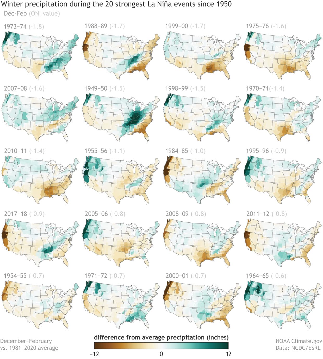
As long-time readers of this blog should know, La Niña (as well as El Niño) often exerts a significant influence on winter climate over North America. This influence means that the U.S. temperature and precipitation patterns for the winter season tend to be more predictable than usual in some regions, as these patterns share many features during most episodes. For instance, most of the 20 strongest La Niña events of the past 70 years have seen drier-than-average conditions across much of the southern tier of the U. S., particularly along the Gulf Coast.
There also appears to be a weaker signal for wetter-than-average conditions around the Great Lakes, Ohio Valley, and in the Pacific Northwest, but these conditions are less consistent from episode to episode. This wetter-than-average signal extends along the northern tier of the U.S., although it’s tougher to see as the departures in this region are smaller. Of course, the reliability of the signals are far less than 100%, with drier-than-average conditions occurring about 70-80% of the time in the Southeast during La Niña, while the other signals are even less consistent.
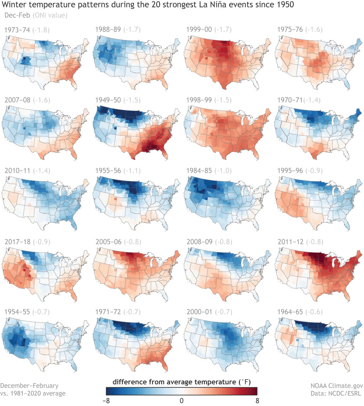
Temperature patterns across the United States during La Niña winters are less consistent than those of precipitation. There is some tendency for above-average temperatures across the southern U.S., with milder-than-average winters across the northern Plains. Temperature trends during winter likely skew the picture somewhat: long-term winter warming over most of the U.S. means that La Niña episodes early in the period tended to be cooler than later episodes. Consistently, many of the La Niña winters during the earlier years depict larger areas of below-average temperatures.
Tilting the odds
Both figures should help the reader understand why climate forecasts are issued in terms of probabilities rather than single outcomes, as we don’t always get the expected (or favored) outcome even when ENSO is stacking the deck in favor of that outcome. In fact, history tells us that even the most reliable signal (like dry conditions in the Southeast during La Niña) only happens about 70-80% of the time. And this point is important enough that I’ll emphasize it again. Climate forecasts can only tell us the most likely outcome, but they provide no guarantees, and the less likely outcome can and should occur at times. Actually, if the probabilities are reliable, the favored outcome should only occur the indicated percent of the time.
For instance, when a forecast map repeatedly shows a 60% chance of above-average temperatures, it also means that we expect that 40% of the time the actual temperatures tied to those forecasts won’t be above average. If that statement has you scratching your head, please see Michelle’s post about the need to play the long game with climate predictions and Tom’s post about how we evaluate these predictions.
And now the outlook!
So how does the NOAA Climate Prediction Center (CPC) see weather shaping up this winter? Not surprisingly, the outlooks bear a strong resemblance to the averages of all the individual maps in the figures above. The outlooks also look fairly similar to the outlooks released for the winter of 2017-18, the last winter that was impacted by La Niña conditions. And interestingly enough, those forecasts verified fairly well, with both the temperature and precipitation patterns that winter strongly resembling the typical La Niña composite.
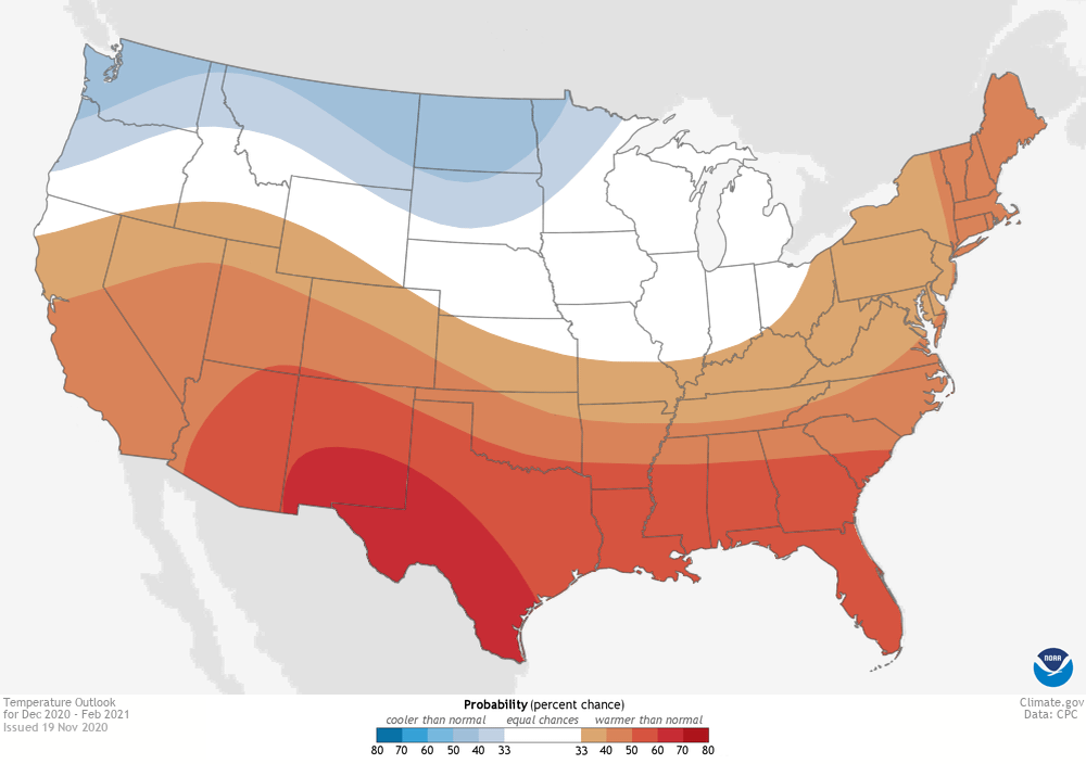
Specifically, the CPC outlook favors above-normal temperatures (2) across the southern and central U.S., extending northward along the East Coast up to Maine. Above-normal temperatures are also favored in Hawaii and in western and northern Alaska. Chances exceed 50% from the Southwest eastward to across Texas, the Gulf Coast states, and into southern South Carolina. Probabilities are tilted toward colder-than-normal temperatures along the northern tier from the Pacific Northwest to western Minnesota and also in southeastern Alaska. However, the probabilities for below-normal indicate lower confidence, with no probabilities in these regions reaching 50%.
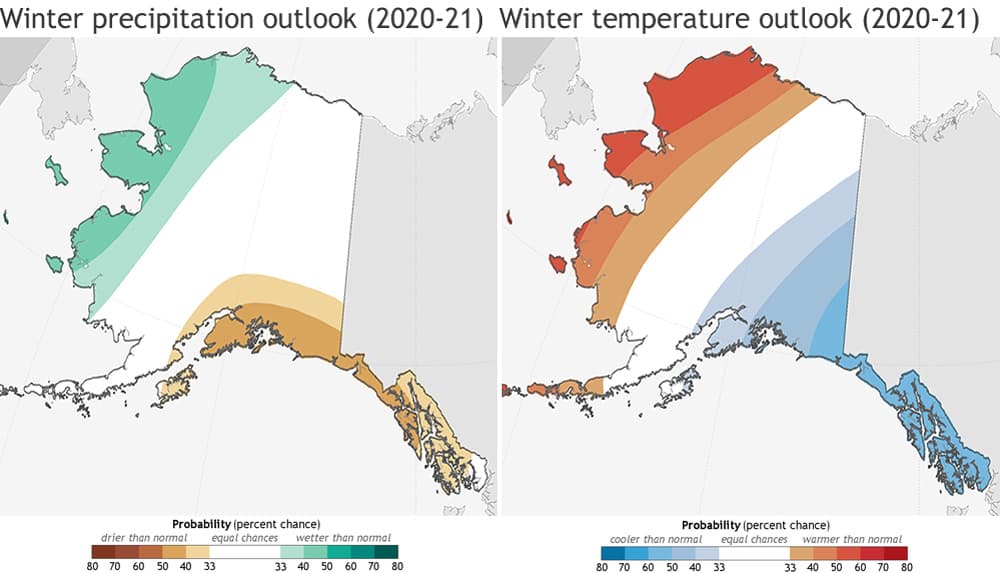
The precipitation outlook favors below-normal precipitation across the entire southern tier of the country and in southern Alaska, with areas from Arizona eastward to Texas, along the Gulf Coast, and in Florida most likely to experience a drier-than-average winter. The below-average probabilities over parts of New Mexico and Texas touch 60%. In contrast, above-average precipitation is most likely in Hawaii, western and northern Alaska, and along the northern parts of the country from the Pacific Northwest, across the northern Plains to the Great Lakes and the Ohio Valley. Confidence in this region is less than across the south, with probabilities not reaching 50%.
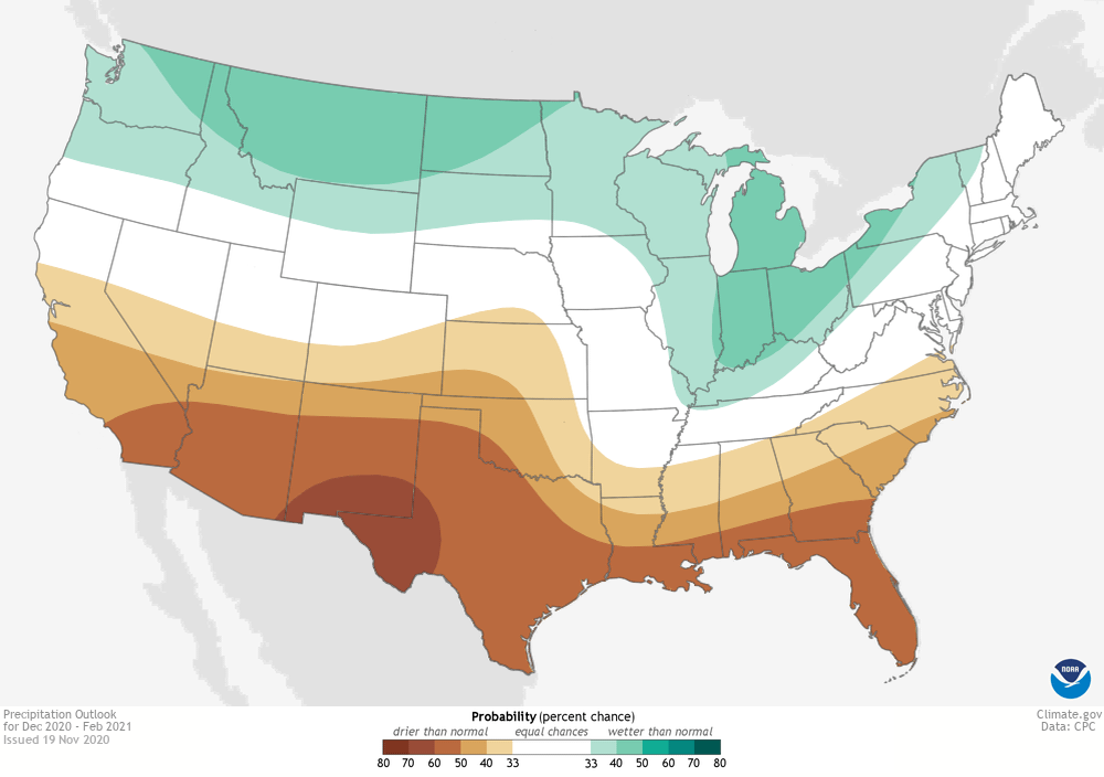
Both maps include blank regions where none of the three categories (above-, near-, or below-normal) is favored. These areas (shown in white and labeled “equal chances”), have the same chance for above-, near-, or below-normal (33.33%) temperature or precipitation. This doesn’t mean that near-average temperature or precipitation is expected this winter in those regions, but rather that there’s no tilt in the odds toward any of the three outcomes.
CPC issues probabilistic seasonal outlooks so that users can take risks and opportunities into account when making climate-sensitive decisions. As discussed above, probabilistic forecasts won’t always result in the favored (or expected) outcome, but users who play the long game find that these outlooks do have skill.
Lead Editor: Nat Johnson, NOAA GFDL
Footnotes
(1) This post discusses the November update to NOAA’s Winter Outlook that was originally released in October. The NOAA Climate Prediction Center’s seasonal outlooks are updated each month all year long, but the November update to the Winter Outlook is the forecast that is used for verification.
(2) This is a good spot to give you a refresher on the format of CPC’s temperature and precipitation outlooks. The three forecast categories—below-, near-, and above-normal—are based on terciles,or “thirds,” of temperature or precipitation distributions from the long-term observational record. The terciles, technically, are the 33.33 and 66.67 percentile positions in the distribution. In other words, they are the boundaries between the lower and middle thirds of the distribution, and between the middle and upper thirds. These two boundaries define the three forecast categories, and over the historical base period, each category occurs 33.33% of the time. The CPC forecasts show the probability of the favored category only when there is a favored category; otherwise, they show EC (“equal chances”). In the maps, the probability is shown only for the favored category, but not for the other two categories. Often, the near-normal category remains at 33.33, and the category opposite the favored one is below 33.33 by the same amount that the favored category is above 33.33. When the probability of the favored category becomes very large, such as 70% (which is very rare for a seasonal outlook), this rule for assigning the probabilities for the two non-favored categories becomes different.