
This article originally appeared on climate.gov
Note: The primary writer of this post is Michelle L’Heureux, but it is inspired by and reviewed by Brian Brettschneider, who is the NWS Climate Service Program manager for the Alaska region.
The last several winters have been depressingly bleak for snow lovers in the Washington, D.C. area, where we at the Climate Prediction Center (CPC) are located. Needless to say, when Brian Brettschneider (@Climatologist49) showed me that the D.C. area historically sees above-average snowfall during El Niño winters, I excitedly dusted off our sleds and ordered new mittens because we’re expecting an El Niño this winter 2023–24. With that said, longtime ENSO blog readers will know that I’m wish-casting a bit and there’s S(no)w guarantee in this business! [And, yes, this blog post will include a painful number of snow puns]. El Niño nudges the odds in favor of certain climate outcomes, but never ensures them. There have been some D.C. area snow droughts during past El Niño winters, and climate change is not our friend.
My next question to Brian was “What exactly is this snowfall dataset you are using?” As Deke Arndt (NCEI) has noted, collecting historical measurements of snow is a tricky endeavor, fraught with measurement errors, so creating a dataset of sufficient quality for climate studies is hard. But, Brian, who is a clever, outside-the-box thinker, realized that the new ECMWF ERA5 reanalysis dataset may be the ticket (footnote #1). About five years ago, my colleague at CPC, Stephen Baxter, published this wildly popular blog post on snow and La Niña winters. The only problem is the dataset he used stopped updating in 2009. Thus, we’ve been adrift, snow-wise, until Brian pointed us to this new snowfall analysis. So, what does it look like?
S(no)w wonder
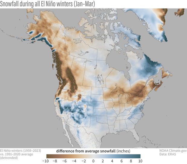
Who are the snowfall winners (or losers) during El Niño? As Emily shared with us last month, the jet stream tends to extend eastward and shift southward during El Niño winters. You can think of the jet stream as a river of air, which carries more moisture and precipitation along the southern tier of the United States during El Niño. As a result, it is not surprising to see a stripe of increased snowfall (blue shading) over the southern half of the country. Obviously, snowfall is limited in its southernmost reaches because it needs to be cold enough to snow, so the effects are strongest in the higher and colder elevations of the West. To the north, however, there is a reduction in snowfall (brown shading), especially around the Great Lakes, interior New England, the northern Rockies and Pacific Northwest, extending through far western Canada, and over most of Alaska. In fact, El Niño appears to be the great snowfall suppressor over most of North America.
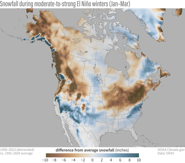
How about snowfall during moderate-to-strong El Niño events like the one expected in winter 2023-24? In the map below, over many regions, the anomalies become stronger (anomaly = difference from the long-term average), which makes sense because El Niño affects the climate. Stronger El Niño events tend to land a larger punch on our atmosphere, thus increasing the chance of seeing expected El Niño impacts.
Snow is flakey
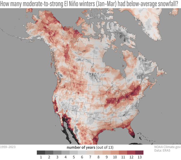
While the maps we’ve shown above may excite or depress you depending on your situation and snow preferences, it is very important to recognize that the map is the showing the average of all winters with El Niño (footnote #2). Relying on the average is a bit dangerous because a few heavy snowfall winters can give the impression that most winters are above average. Which is why it’s important to recognize there can be large variation from winter-to-winter.
Below is a map showing a count of El Niño winters: Here, we ask how many of the 13 moderate-to-strong El Niño winters had below-average snowfall? If it is in red shading, that means most winters had below-average snowfall. The deepest reds mean almost all past winters had below-average snowfall (black indicates no snowfall at all, which makes sense if you’re sitting on a beach in South Florida). If it is in grey shading, that means most moderate-to-strong winters had above-average snowfall.
S(no)w win situation
Another major caveat related to these maps is they are just based on snowfall during El Niño, and I have removed long-term trends. There is also a trend in snowfall, and it looks like this over North America during January-March.
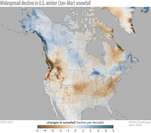
Unsurprisingly, because of climate change, over most of the contiguous United States we have trended toward less snowy winters. This doesn’t mean that it never snows, or we cannot get big snowstorms (footnote #3), but that snowfall has gradually trended downward over time. In contrast, wintertime snowfall may have actually increased somewhat over time over the colder northern latitudes of Alaska and parts of Canada (this trend reverses in the spring; see footnote #4). Why would that be the case? Well, if you think about it, the warming of our planet allows the air to hold more moisture. If the atmospheric circulation allows for it, then that moisture can be wrung out of the air and precipitate. Snowfall also depends on the air temperature remaining below the freezing point. At more northern latitudes, despite warming air temperatures, it still remains cold enough in the winter to fall as snow. But there is no such luck in more southern locations which are often closer to the freezing point. There, the tendency toward warmer winters is a snow killer.
So, will the expected pattern of El Ni-S(ño)W pan out for us this winter? Time will tell, but in the meantime, it is fun to imagine the possibilities.
Footnotes
(1) We have to be careful to not take any one dataset literally, but this ECMWF ERA5 data seems to pass a few sniff tests. Sniff test #1 was “Does ERA5 snowfall reproduce the winter pattern of snowfall made with other datasets?” The answer, at least when comparing with winter 2022-23, is yes. Sniff test #2 was “Does ERA5 snowfall reproduce the historical ENSO pattern that is found within other datasets?” Here again, the answer is yes, we were able to reproduce ENSO composite maps that were made with the Rutgers gridded snow data in this older ENSO blog post. Sniff test #3 was comparing with our old ENSO snowfall composites made from an even older (not quality controlled) station-based dataset that has been discontinued. With that said, ERA5 is a newer dataset, it is “reanalysis,” which means that a very short-range weather model is used to produce snowfall from in situ observations (from the ECMWF website, it outputs the “mass of snow that has fallen to the earth’s surface”). Essentially a reanalysis is predicting what observed snowfall would have looked like based on past observational inputs from satellites, stations, buoys, and other observing systems. Therefore, we recommend you treat some of the finer details with a healthy degree of suspicion and try to corroborate them in other datasets. Hopefully this blog post will motivate the creation of additional snowfall datasets and scientists will explore how well ERA5 compares with these other snowfall measurements.
(2) Brian emphasizes that composites (average historical maps during El Niño) are retrospectives and they are not a forecast. A forecast takes in account conditions beyond just El Niño, such as long-term climate trends, soil moisture, sea ice, and other global boundary forcings.
(3) In fact, because a warmer atmosphere carries more moisture, there is published evidence that extreme snowfall events can intensify as a response to global warming (e.g. O’Gorman, P., 2014: Contrasting responses of mean and extreme snowfall to climate change. Nature, 512, 416–418).
(4) This pattern of snow trends drastically changes if you look at the shoulder seasons, say April-June, which is warmer even in those northern latitudes. Rebecca took a look at this in this climate.gov article on spring snow cover in the Northern Hemisphere. In this season, trends are toward less snow cover over Alaska and western Canada. The ERA5 snowfall trends in April-June also reproduce the same features.