
NOAA first starting crying “El Nino” back in June 2014. Originally, they predicted a strong El Nino, then a weak El Nino and both were forecasted to begin in October or so.
To be honest, we were excited about El Nino. Were hoping it could end the drought on the West Coast. So we waited and waited and waited and it never came.
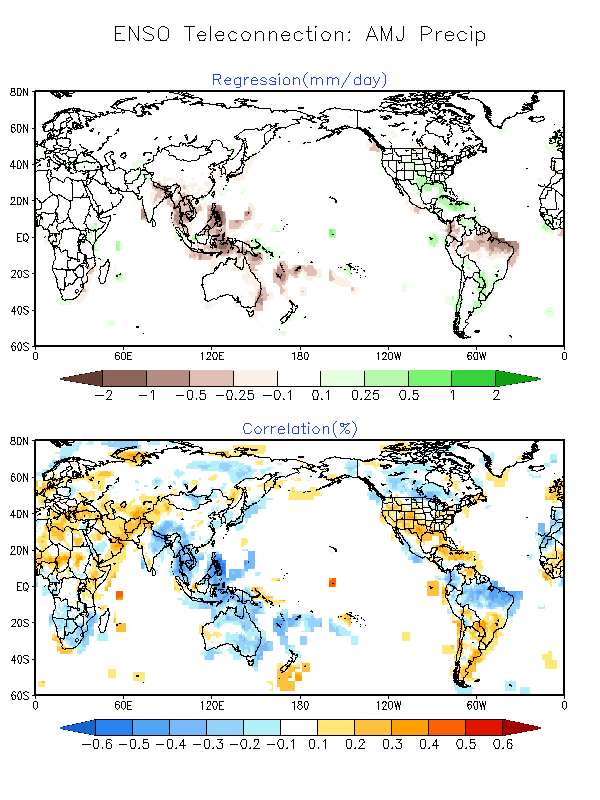
Now, NOAA has finally detected an El Nino pattern and has issued an El Nino Advisory. The historical data they display in the map above shows California receiving above average precipitation. We’re ok with that.

- Historical March – May El Nino Precipitation patterns.
NOAA’s EL NINO ADVISORY:
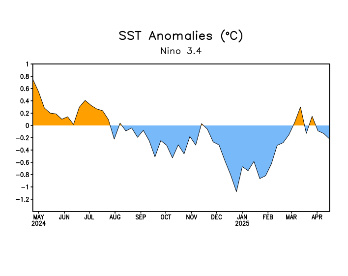
Over the last several months, we’ve seen warmer-than-average sea surface temperatures (SSTs) in the tropical Pacific, including the Niño3.4 region, which we track as one indicator of El Niño. The seasonal Niño3.4 Index has been at or above 0.5°C since September, and the most recent weekly Niño3.4 index was +0.6°C.
The El Niño/Southern Oscillation (ENSO) is a coupled phenomenon, though, so we also monitor the atmosphere for signs that it is responding to those positive SST anomalies. For the last few months, we’ve been seeing some suggestions of borderline atmospheric El Niño conditions, but until this month we were below that borderline. This month, we’ve finally crept above it, and thus NOAA is declaring the onset of El Niño conditions.

Summary of decision process in determining El Niño conditions. Figure by Glen Becker and Fiona Martin.
What tipped us over the line?
What’s different this month? For starters, it’s the second month in a row with a negative value for the Equatorial Southern Oscillation Index (EQSOI, -0.5 for February), one indicator of a weakenedWalker Circulation. Also, the pattern of below-average rainfall in the central Pacific, which wasvery inconsistent with El Niño, recently transitioned to near-average rainfall (as indicated byoutgoing longwave radiation). The increased rainfall we were seeing in the western equatorial Pacific continued.
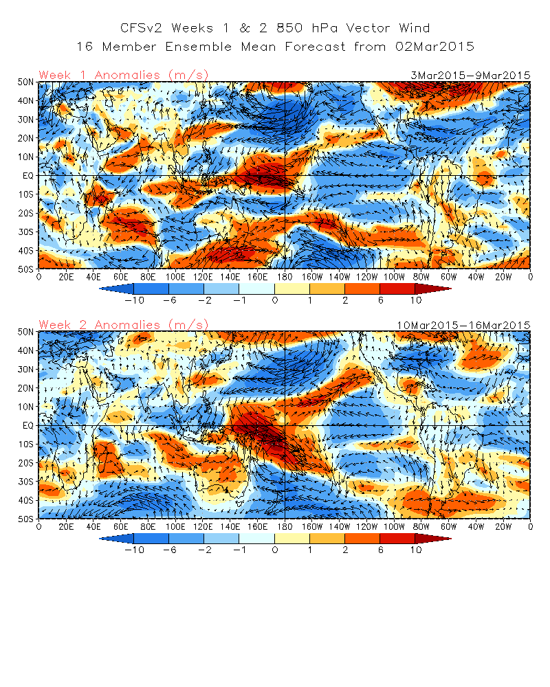
Late January and February saw a couple of westerly wind bursts over the central tropical Pacific, and the forecast for the first two weeks of March suggests these winds will continue. When the winds in this region turn more westerly, they can encourage movement of warmer surface waters eastward and either trigger or strengthen downwelling Kelvin waves, leading to warmer SST anomalies in the central and eastern parts of the tropical Pacific.
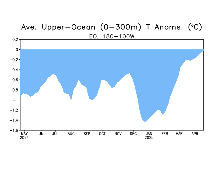
Also, over the last month, we saw an increase in sub-surface heat content and the growth of a moderate downwelling Kelvin wave. This suggests that there is likely to be a continuing source of warmer-than-average ocean temperatures for the next couple of months, potentially encouraging the continuation of the weak atmospheric coupling.
On the other hand—showing that we are still very close to the borderline—the Tahiti – Darwin SOI, another indicator of ENSO (though farther off the equator compared to the EQSOI), was +0.2 for February. Also, the “near average” rainfall in the central Pacific combined with above-average rainfall in the western Pacific is not a strong indication of El Niño conditions. As we’ve discussed before, a strong signal would be above-average rainfall in the central and eastern Pacific, andbelow-average rainfall over Indonesia.
Going forward, we will need to continue to monitor whether pressure and rainfall across the equatorial Pacific remain consistent with El Niño conditions.
But what does it mean for North American and global weather?
At this time, these are extremely weak El Niño conditions, during a time of year when the influence of El Niño on weather patterns in North America or other locations outside of the Tropics is weakening. For example, historical precipitation patterns associated with El Niño show that only about 3 of the past 10 El Niño years exhibited above-average rainfall in California during March-April-May (map pair below). Another way of looking at the historical relationships shows that ENSO has very little correlation to precipitation over North America during the spring.

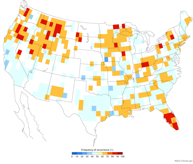
Difference from average March-May precipitation (left) and how often that anomaly occurred (right) during ten El Niño years between 1953 and 2010. NOAA Climate.gov graphic by Fiona Martin, based on data provided by Emily Becker, Climate Prediction Center. (See our featured image for more explanation on how to interpret these maps.)
The current warm SST anomalies are greatest in the Central Pacific (see map below). ENSO events centered in this area tend to be weaker (see Michelle’s post on ENSO flavors for more on this).
Especially since the rainy season in the West is winding down by March, it is unlikely that these current El Niño conditions will lead to substantial, drought-breaking rains.

Sea surface temperature departures from average (based on 1981-2010) at the end of February 2015. NOAA map by Emily Becker, Climate Prediction Center.
What’s to come?
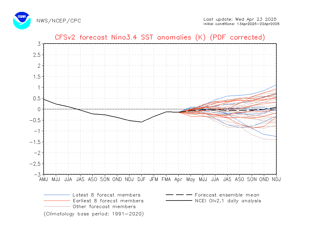
The CPC/IRI consensus forecast calls for an approximately 50-60% chance that El Niño conditions will continue through the spring. In the ocean-atmosphere coupling indicative of El Niño, warmer waters lead to atmospheric changes, and those atmospheric changes in turn help maintain the warmer water. So, it’s possible that even the weak coupling we’re seeing now will support the continuation of the positive SST anomalies. As I mentioned above, the recent westerly wind anomalies and the downwelling Kelvin wave will also help to keep the SSTs above average for the next few months.
Dynamical climate models are mostly forecasting a slow increase in the Niño3.4-region SST anomalies throughout 2015. Springtime is a difficult time of year for forecasting, as models traditionally have some difficulty seeing beyond the so-called “spring barrier,” and so the CPC/IRI consensus forecast probabilities decrease somewhat going into the summer, as forecast confidence decreases. That said, probabilities remain at or above 50% that El Niño conditions will continue through the fall.
After twelve months of El Niño Watches, we are issuing an El Niño Advisory. However, what it really represents is an incremental crossing of the borderline. If we follow the “Is it El Niño Conditions” flowchart, the warmer SST conditions, our anticipation that they will continue for the next several seasons, and signs of weak atmospheric coupling over the past month, mean we arrive at “yes!” From an impacts perspective, this is notparticularly momentous, as El Niño impacts are weak in the spring and summer. Still, after months of hovering under the threshold, we can now say that El Nino conditions have arrived.
How does El Niño affect U.S. spring precipitation?
After months of straddling the fence, the atmosphere and ocean over the tropical Pacific have finally leaned far enough toward El Niño that forecasters have declared an El Niño advisory. In this week’s ENSO blog, Emily Becker with NOAA’s Climate Prediction Center explains the atmospheric and oceanic conditions that finally—but barely—tipped the scales.
This map pair from the blog shows how El Niño has affected U.S. precipitation during the 10 years of the modern instrument record during which El Niño was present in the spring: 1953, 1957, 1958, 1966, 1969, 1983, 1987, 1992, 1998, and 2010).
The map on the left shows March-April-May precipitation during those ten years compared to the long-term average, with browns indicating drier–than-average springs, and greens and blues indicating wetter-than-average springs. The map on the right shows how often that wet or dry precipitation pattern occurred. “Cool” colors indicate the particular wet or dry signal occurred less than 50 percent of the time, while “warm” colors indicate frequencies above 50 percent (meaning 5 or more years out of 10).
The maps show that spring precipitation in some parts of the United States has a reliable connection to El Niño. Across the mountainous regions of the Pacific Northwest, for example, a moderate dry signal (dark browns) occurred between 60-70 (orange) and 80-90 (red) percent of the El Niño springs on record. The Great Lakes region and the Ohio Valley also saw moderately dry springs from 60-70 to 80-90 percent of the time.
A strong wet signal (dark green and blues) shows up in coastal Northern California, northeast Texas, central Florida, and the Northeast coast from Massachusetts to New Jersey. But the reliability of that signal varies considerably from one place to another. The most reliable wet spring signal appears in central Florida, where it occurred in up to 9 years out of 10 (red areas). In most of California and Texas, on the other hand, El Niño brought wet springs less than 50% of the time (light blue and cyan).
As far as using the past to infer what a given region might expect from the current El Niño, a final important point to remember is that the maps above show the precipitation patterns during all El Niños of the modern record, regardless of how strong or weak they are. The current El Niño is weak, and it’s generally the case that the weaker the El Niño, the more likely it is that other weather variability will drown out its influence.
So basically… i t may, or may not have any effect on anything… ok thanks.